Matplotlib Examples
matplotlib is used to plot data. It is a powerful library that is interfaced to TRIQS.
Goal of this tutorial
This is an illustration of an IPython notebook. It will plot the functions
and
Afterwards we’ll see how to create and modify plots.
Inline plots
To access NumPy and matplotlib commands and to plot directly in the notebook, run:
[1]:
import numpy as np
import matplotlib.pyplot as plt
%matplotlib inline
# change scale of all figures to make them bigger
import matplotlib as mpl
mpl.rcParams['figure.dpi']=100
[2]:
# The plot command takes the x coordinates as first argument
# then the y coordinates. The third argument controls the
# way points look on the plot
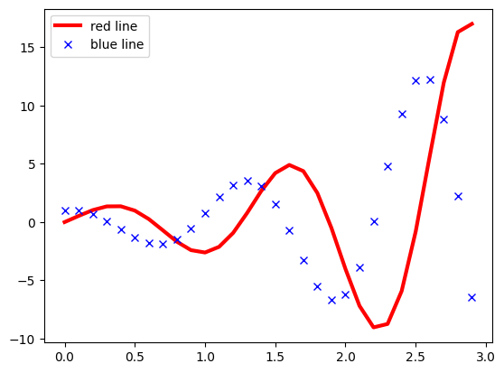
xr = np.arange(0,3,0.1)
yr1 = np.exp(xr) * np.sin(5*xr)
yr2 = np.exp(xr) * np.cos(5*xr)
plt.plot(xr, yr1, '-r', lw=3, label = 'red line')
plt.plot(xr, yr2, 'xb', label = 'blue line')
plt.legend()
[2]:
<matplotlib.legend.Legend at 0x14a7b92f9490>
Making the plot prettier
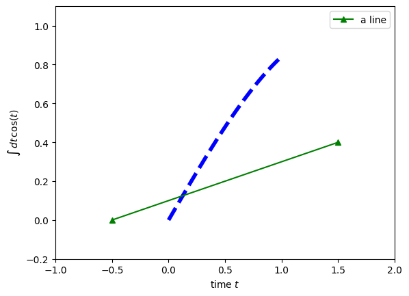
We start off with the simplest example of a single plot. Note how you can change the line style, its width, the color and the symbols. The labels of the axis and their range is easily controlled.
[3]:
xr = np.arange(0,1,0.01)
yr = np.sin(xr)
plt.plot(xr,yr,'--b',lw=4)
plt.plot([-0.5,1.5],[0.0,0.4],'-g^',label='a line')
plt.legend()
plt.xlabel('time $t$')
plt.ylabel(r'$\int \,dt\, \cos(t)$')
plt.axis([-1,2,-0.2,1.1])
[3]:
(np.float64(-1.0), np.float64(2.0), np.float64(-0.2), np.float64(1.1))
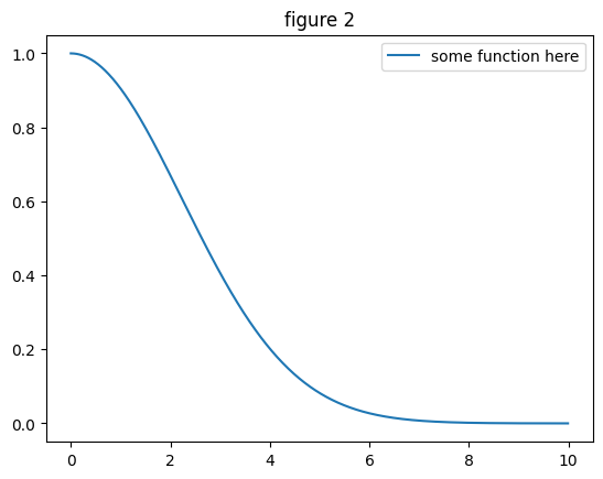
Subplots
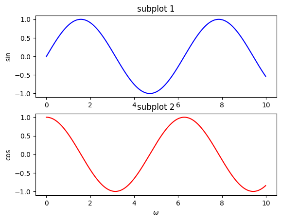
When you want to create subplots, you first have to create a figure. Then with the command
subplot(l,m,i)
you can create an \(l \times m\) array of plots and select the \(i\)-th subplot.
[4]:
xr = np.arange(0,10,0.01)
plt.figure(1)
plt.subplot(2,1,1)
plt.plot(xr,np.sin(xr),'b')
plt.title("subplot 1")
plt.ylabel('sin')
plt.subplot(2,1,2)
plt.plot(xr,np.cos(xr),'r')
plt.title("subplot 2")
plt.ylabel('cos')
plt.xlabel(r'$\omega$',)
plt.figure(2)
plt.plot(xr,np.exp(-0.1*xr**2),label='some function here')
plt.legend()
plt.title("figure 2")
[4]:
Text(0.5, 1.0, 'figure 2')
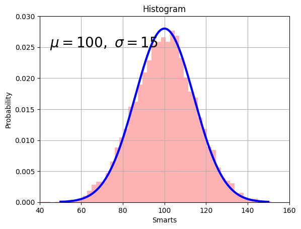
Histograms and text
The example below shows how to create a histogram and how to add text in the plot. Note how \(\alpha = 0.3\) is used to control transparency.
[5]:
mu, sigma = 100, 15
x = mu + sigma * np.random.randn(10000)
xr = np.arange(50,150,0.1)

plt.hist(x, 50, density=1, facecolor='r', alpha=0.3)
plt.plot(xr,0.028*np.exp(-0.0025*(xr-100)**2),'b',lw=3)

plt.xlabel('Smarts')
plt.ylabel('Probability')
plt.title('Histogram')
plt.text(45, .025, r'$\mu=100,\ \sigma=15$',fontsize=20)
plt.axis([40, 160, 0, 0.03])
plt.grid(True)
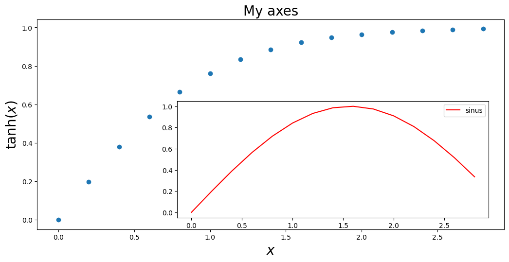
Python-like approach to matplotlib
Above, we have used a matlab-like commands to control the plot creation. Behind the curtains Matplotlib still works with Python objects, so that a figure is a Python object. Adding a plot in the figure is then done with the
add_axes
command. This creates an “axes” object (a plot). Calling the methods
set_title
set_xlabel, ...
you can act on the different parts of the plot, etc. This approach is powerful and allows you to easily put an inset in your plot.
[6]:
xr = np.arange(0,3,0.2)
yr = np.tanh(xr)

fig = plt.figure(1)
ax = fig.add_axes([0., 0.8, 1.5, 0.9])
ax.set_title("My axes",fontsize=20)
ax.set_xlabel(r'$x$',fontsize=20)
ax.set_ylabel(r'$\tanh(x)$',fontsize=20)
ax.plot(xr,yr,'o')
subax = fig.add_axes([0.45,0.85,1.,0.5])
subax.plot(xr,np.sin(xr),'r',label='sinus')
plt.legend()
[6]:
<matplotlib.legend.Legend at 0x14a7b8b2ee40>
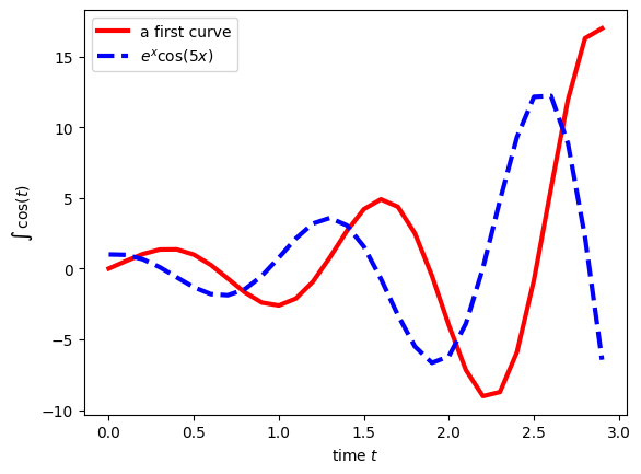
More examples
Here are some additional examples. They summarize what is described above.
[7]:
xr = np.arange(0,3,.1)
yr1 = np.exp(xr)*(np.sin(5*xr))
yr2 = np.exp(xr)*(np.cos(5*xr))
plt.figure(1)
plt.plot(xr,yr1,'-r',lw=3, label='a first curve')
plt.plot(xr,yr2,'--b',lw=3, label=r'$e^{x} \cos(5 x)$')
plt.legend()
plt.xlabel('time $t$')
plt.ylabel(r'$\int \, \cos(t) $')
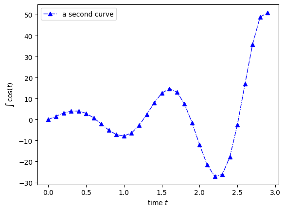
plt.figure(2)
plt.plot(xr,yr1*3.,'-.b^',lw=1, label='a second curve')
plt.legend()
plt.xlabel('time $t$')
plt.ylabel(r'$\int \, \cos(t) $')
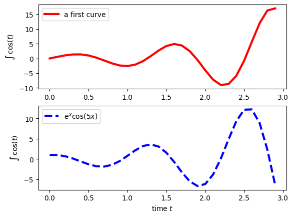
plt.figure(3)
plt.subplot(211)
plt.plot(xr,yr1,'-r',lw=3, label='a first curve')
plt.legend()
plt.ylabel(r'$\int \, \cos(t) $')
plt.subplot(212)
plt.plot(xr,yr2,'--b',lw=3, label=r'$e^{x} \cos(5 x)$')
plt.legend()
plt.xlabel('time $t$')
plt.ylabel(r'$\int \, \cos(t) $')
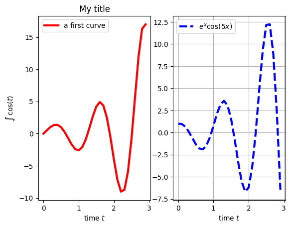
plt.figure(4)
plt.subplot(121)
plt.title('My title')
plt.plot(xr,yr1,'-r',lw=3, label='a first curve')
plt.legend()
plt.ylabel(r'$\int \, \cos(t) $')
plt.xlabel('time $t$')
plt.subplot(122)
plt.grid(True)
plt.plot(xr,yr2,'--b',lw=3, label=r'$e^{x} \cos(5 x)$')
plt.legend()
plt.xlabel('time $t$')
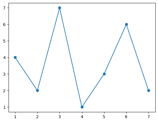
plt.figure(5)
a = np.loadtxt("sample.dat")
plt.plot(a[:,0],a[:,1],'-o')
[7]:
[<matplotlib.lines.Line2D at 0x14a7b71598e0>]